A Monument customer can hold easy-access savings, a Cash ISA, a limited-access
saver, notice accounts and fixed-term deposits at the same time. Each has different rules about
when money can leave.
I designed the move-money journey from zero so that one action behaves correctly
across all five products—without asking customers to learn the rules first.
The resulting journey was adopted by Ecology Building Society and Castle Trust Bank.
Role Lead Product DesignerScope End-to-end journey, 0-1
01 The problem
Five products, five different answers.
Customers can hold all of these products at the same time. Moving money
between them is not one
operation with one rule, it is five, and they are not symmetric: money goes into a notice
account freely and only comes out on a schedule.
01
Easy access, and the ISA
The only case where move means move. The money leaves today, which is what every customer
assumes is true of all of it, because that is what moving money means everywhere else they
have ever done it.
02
Limited access saver
Customers can make three withdrawals a year at the advertised rate. A fourth withdrawal
is still possible, but it reduces the rate for the rest of the year. Because the withdrawal is
allowed, the consequence can be easy to miss, so the journey has to make it clear before the
customer commits.
03
Notice accounts
Customers can add money at any time, but can only withdraw once notice has been served.
The same account can be a destination immediately, but only becomes an eligible source when
the notice period has ended.
04
Fixed term deposits
Nothing leaves until maturity. Past the fourteen day funding window there is no route out
at all, at any price, which is the hardest thing a savings app ever has to tell somebody about
their own money.
02 The decision
Do not explain the rules. Take away the wrong answers.
The instinct with a rule set this size is to write it down somewhere in the
journey and hope people read it. They do not read it, and putting it in front of them makes a
two tap job feel like paperwork. So I went the other way.
01
The list only offers what can actually move
An account whose money is not available today is not selectable as a source. A notice
account appears once
the notice has been served or the term has matured, and not before. Nobody gets as far as
choosing an option and then gets told no, because the option was never there.
02
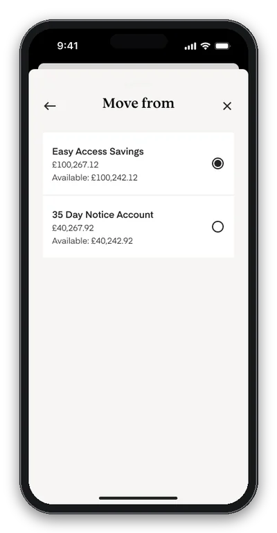
Every row carries the number that matters
Balance and available, on the same row, at the moment of choosing rather than two
screens later. A hundred thousand in the account and a hundred thousand less twenty five
pounds available is not a rounding difference to the person moving their savings.
03
Where the answer is no, say why and say when
Fixed term and limited access still appear, not selectable, carrying the reason and the
date the money frees up. Hiding them completely would make the app look broken to somebody
who knows perfectly well that their money is in there.
03 The journey
Four steps, and the ones that go wrong.
Every screen below is designed, including the ones nobody asks for. The error
states are not an appendix here, they are most of the reason the journey works.
01
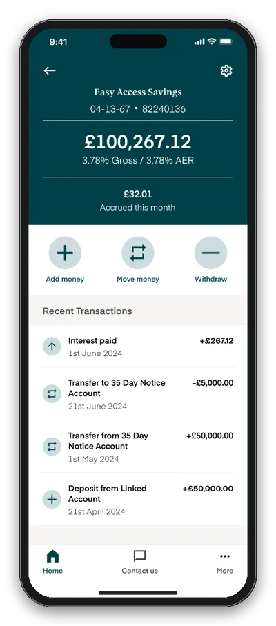
It starts at the account, not at a menu.
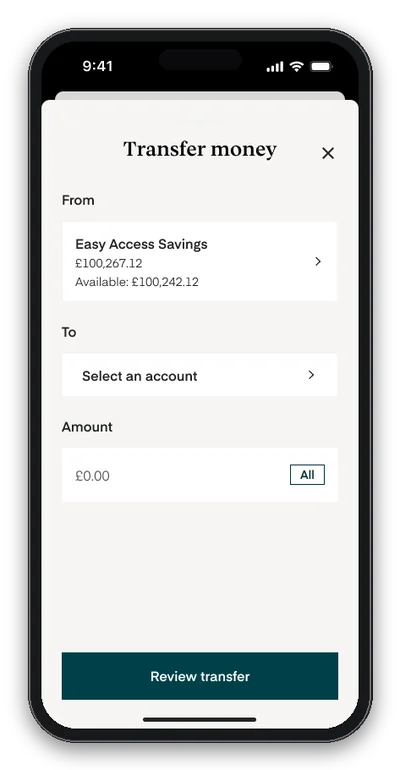
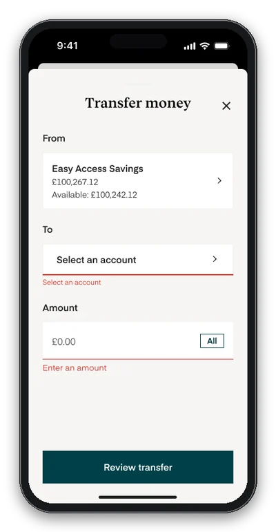
Add money, Move money and Withdraw sit together on the account itself, so From is filled in before the sheet opens and the three things people actually come here to do are named separately. Naming them separately is the point: moving to a notice account and withdrawing to your own bank are different acts with different consequences, and a single Transfer button would have blurred them. Validation waits until someone tries to continue, and then sits under the field that failed rather than in a banner at the top.
The account, and the two numbers that matterFrom is already filled inValidation under the field that failed
02
Two pickers, and the second one knows about the first.
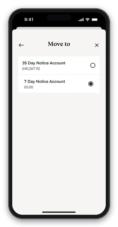
The destination list never contains the account being moved from, which removes the one error every transfer form in the world lets people make. Each row carries its own balance and available figure, so the decision is made with the numbers in view rather than remembered from the screen before.
Only the accounts money can actually leaveThe account being moved from is not in the list
03
The amount, and the ceiling on it.
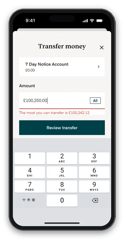
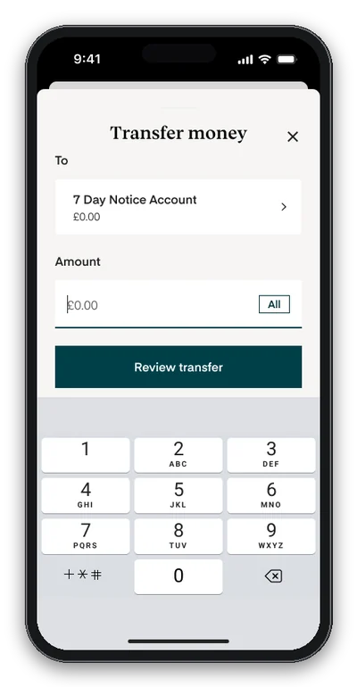
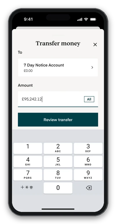
The keypad comes up with the field, and All fills the available figure rather than the balance, which is exactly the difference that catches people out. Go over and the message names the actual maximum instead of saying insufficient funds, so the correction is a number somebody can type rather than a guess they have to make twice.
All fills the available figure, not the balanceNinety five thousand of it, on the moveThe message names the actual maximum
04
Review, then the one tap that cannot be taken back.
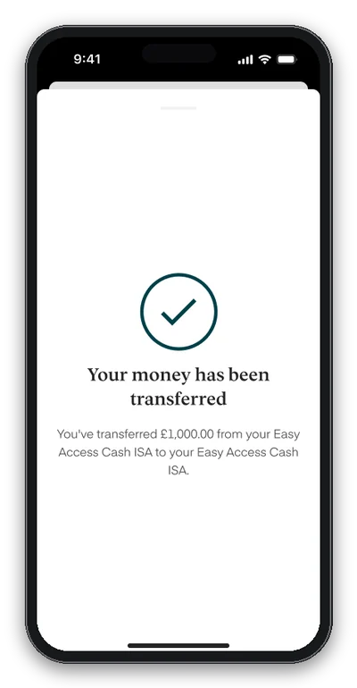
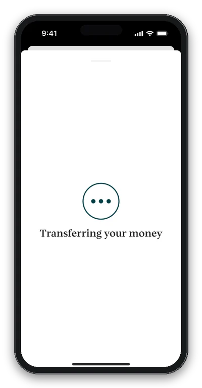
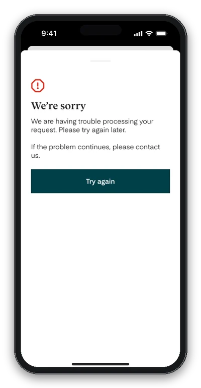
Everything shown back with an Edit button beside the amount, because the amount is the thing people change their mind about and sending them to the start to change it is how you lose them. After Confirm there is a real wait, so the app says so. If it fails it says what happened, offers the retry, and names the way out if the retry does not work either, which is the difference between a failure and a dead end.
Everything back, with Edit beside the amountThe one moment the app asks for patienceA failure with a way forwardWhat moved, from where, to where
Implemented by two banking partners.
The end-to-end move-money journey was implemented by Ecology Building Society and Castle Trust Bank.
04 What I took from it
The hard part of a transfer is the money that cannot move.
01
Removing an option is a design decision
It needs the same care as adding one, and it needs a reason attached. An account that
vanishes from a list without explanation reads as a bug to the person whose money is in it,
which is why the locked ones stayed visible.
02
Available is a different number from balance
Everyone in the building knows that and nobody outside it does. Printing both, everywhere
an account appears, cost almost nothing and takes out a common reason a transfer is
rejected.
03
Say the number, not the category
Insufficient funds tells somebody they were wrong. The most you can transfer is one hundred
thousand two hundred and forty two pounds and twelve pence tells them what to type. It is the
same information and it is not the same message.