Monument Technology: Savings Account Onboarding
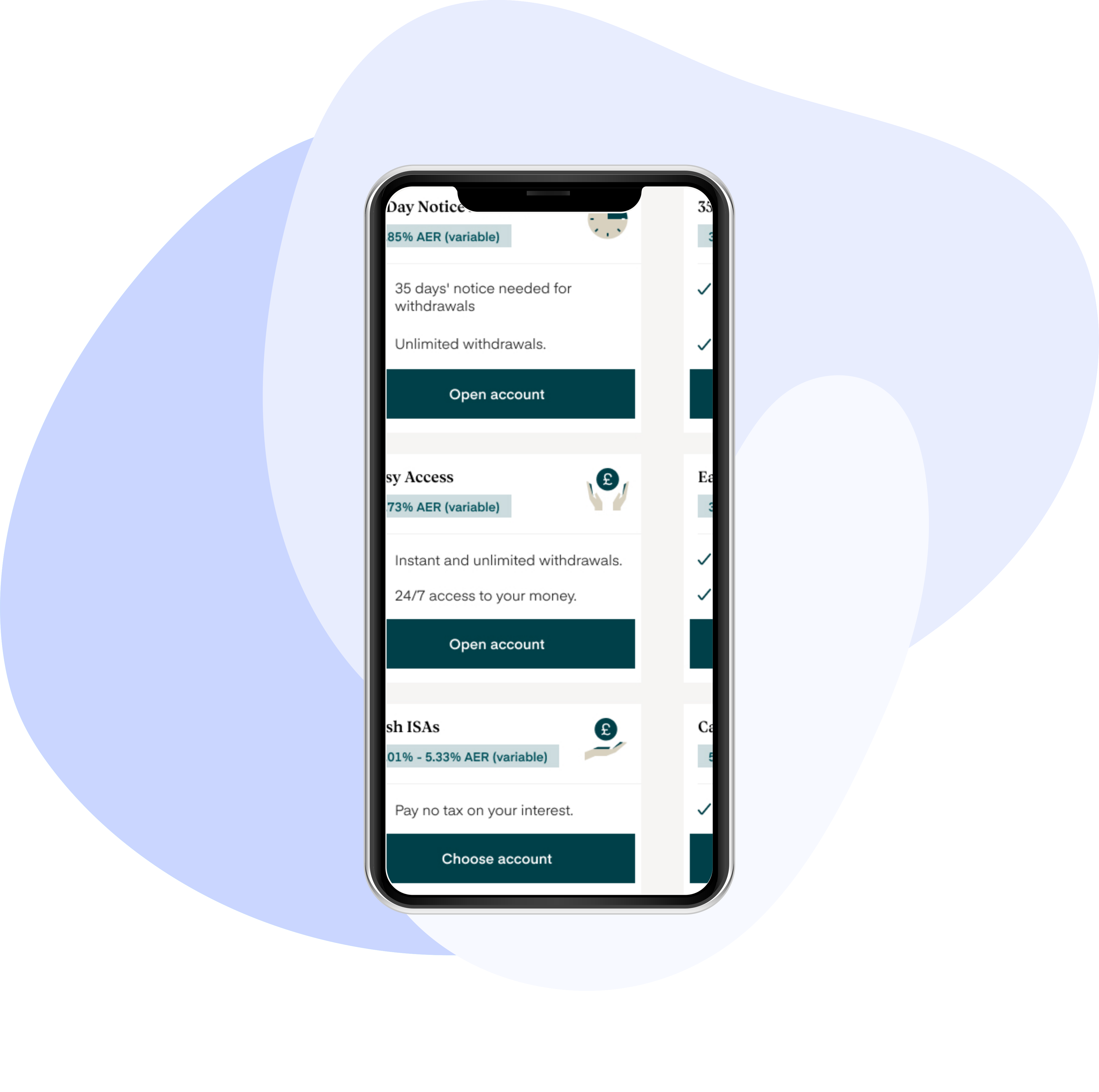
How might we turn a list of regulatory requirements into an onboarding journey people can actually get through with the structure, consistency and branding to bring customers to Monument and get them to a funded account?
Monument Technology builds digital banking for savers. Opening a savings account is one of the most tightly regulated journeys you can design: before an account can be funded.
I joined five months into the project. The requirements had been gathered, but nothing had been designed or built - no flows, no structure, no design system, and nothing that looked like Monument can present it to clients. Everything between the first screen and a funded account was still to be worked out: the order the questions should be asked in, how each one should be framed, and what happens when a step goes wrong.
I designed the journey end to end, from the first screen someone sees through to a funded account - 124 screens in total, including the regulatory branches and error states that decide whether an application is ever finished.
Why this journey needed the most attention
Three things made this harder than an ordinary sign-up flow, and each one shaped how I approached it.
Design process
I led the UX design for Monument's savings account onboarding. The first experience anyone has of the product. I started by mapping every piece of information we're legally required to collect against the step it would live in, which showed me where the journey would be hardest and where it would need to branch. I then ran working sessions with compliance and with the web and app development teams to understand what each step could realistically support: which lookups fail, which verifications time out, and where we had no room to move.
I wanted the routing question that determines the tax section to sit as early as possible. Tax residency runs to thirteen screens, with four more for US taxpayers under FATCA, and most customers pay tax only in the UK — asking them upfront meant the majority could skip a section that had nothing to do with them. This was a harder sell to compliance. Their concern was legitimate: CRS and FATCA reporting depends on correctly identifying anyone tax resident in more than one country, and routing people out of that section early on a single self-declared answer risked missing someone we were legally required to catch. A usability improvement for the majority is not worth an under-reporting failure.
I met with product manager to work through what the routing actually needed to guarantee. Working together we agreed the question could stay where I wanted it.
That gave the majority a much shorter path without weakening the reporting. Once I had the requirements settled, I built prototypes and took them back to the team to work through iteratively.
Solution
Before I designed any screens, I wanted the team to agree on the shape of the journey - the order the questions would be asked in, where it branched for tax residency, and what happened at each step that could fail. I mapped the whole thing end to end so everyone could see it in one place rather than in a list of requirements, and shared it with the web and app development teams to work from while the flows were being built.
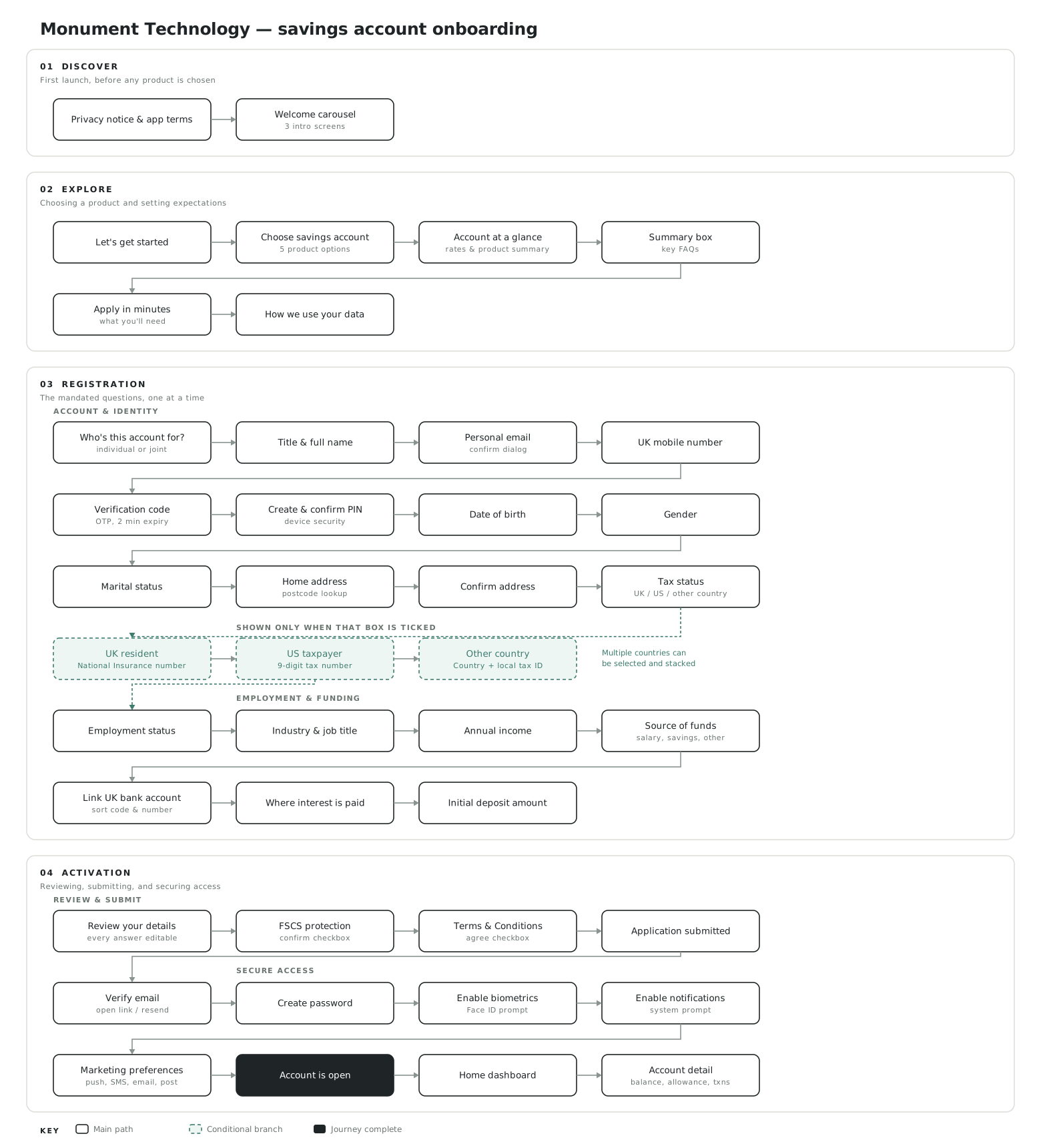
Fig: Flowchart of on-boarding
Visual direction
The questions in this journey are set by regulation. I could not remove any of them to make the application shorter, so every improvement had to come from the order they were asked in, the way they were worded, and what happened when a step went wrong.
There was also nothing underneath it. The requirements had been gathered but nothing had been designed: no flows, no structure & no design system. Every pattern had to be decided from scratch before it could be repeated, and with 118 screens across web and app, an inconsistency introduced early would have had to be found and fixed everywhere later.
The easy option was to reach for standard form patterns, ship something that worked, and accept the drop-off as the cost of being a regulated product. Instead I broke the data set into single decisions, designed a recovery path for every step that could fail rather than only the ones that were obvious, and built the components so that all the screens behaved the same way. It took considerably longer, and it is the reason the journey holds together rather than reading as a sequence of forms.
Designing for What Goes Wrong
Designing the happy path was the easy part. What took the time was everything around it — the states people land on when a lookup fails, a code never arrives or a form is submitted half-finished. Around a fifth of the registration screens ended up being exactly that, and in my experience they are what decides whether an account actually gets opened.
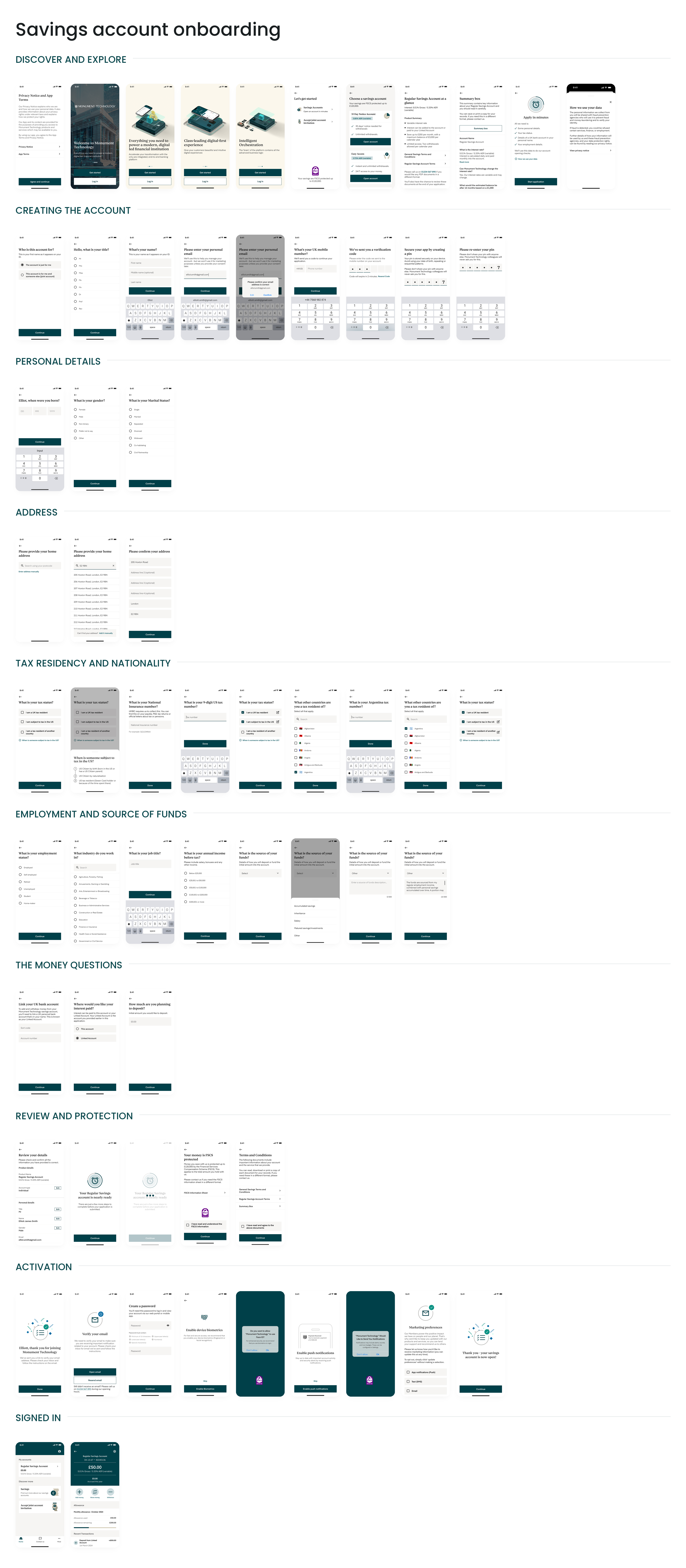
Mobile verification is the clearest example. People get stuck there constantly, almost always for reasons that have nothing to do with them: the text is slow, the number was typed wrong, the phone is in another room. One generic error message covers none of those, so I designed three separate states with a different way forward for each.
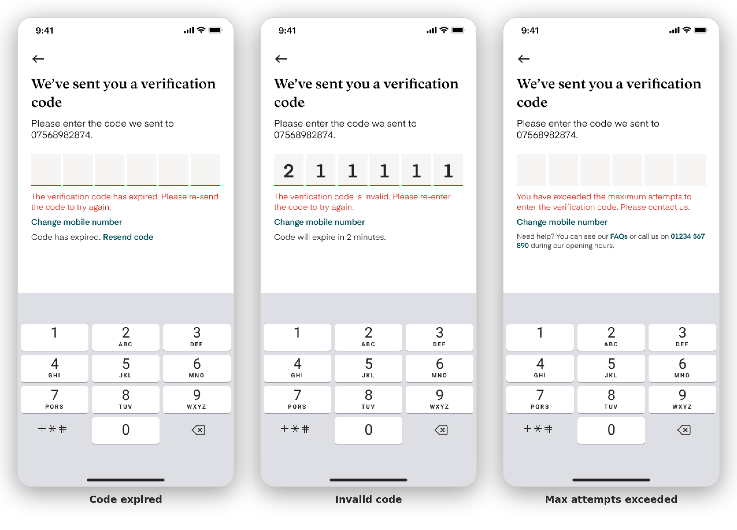
The New Onboarding Journey
Results
The journey went from a set of regulatory requirements to a complete, branded onboarding flow that Monument Technology could put in front of its clients. It is now used by two of them.
I don't have access to post-launch performance data. If I did, the figures I would want are completion rate through registration, where drop-off clusters across the stages, time to complete against the five minutes we promised, and support contact on the verification step — the places these design decisions were aimed at.
The screens that determine whether someone opens an account are rarely the most enjoyable to design. They are often the moments people reach when a lookup fails or a code never arrives. I learned to give these experiences the same attention as the main flow, rather than treating them as edge cases to tidy up at the end.
Working closely with developers also changed how I approached handover. Establishing clear communication channels and a weekly design clinic meant edge cases surfaced early enough to design for, rather than appearing as bugs after build.
Working this closely with developers changed how I hand things over. Setting up proper channels and a weekly clinic meant edge cases surfaced while there was still time to design for them, instead of arriving as bugs after build.