Building and scaling a design system
Creating a simple yet impactful Nebula design system for Vanguard's B2B and B2C platforms.

How can I create a design system that is efficient for both B2B and B2C platforms which is simple, scalable, and understandable by designers and developers?
When I joined Vanguard they didn't have any design system in place except some brand guidlines. Every time we started a new project or started a new phase of the project we were creating projects from scratch. This would mean setting up a new components library each time. This meant we were designing the same components over and over again with the style changing each time to suit functionality.
We needed to recreate old components and gather all old use cases and create use cases for each component
Execution
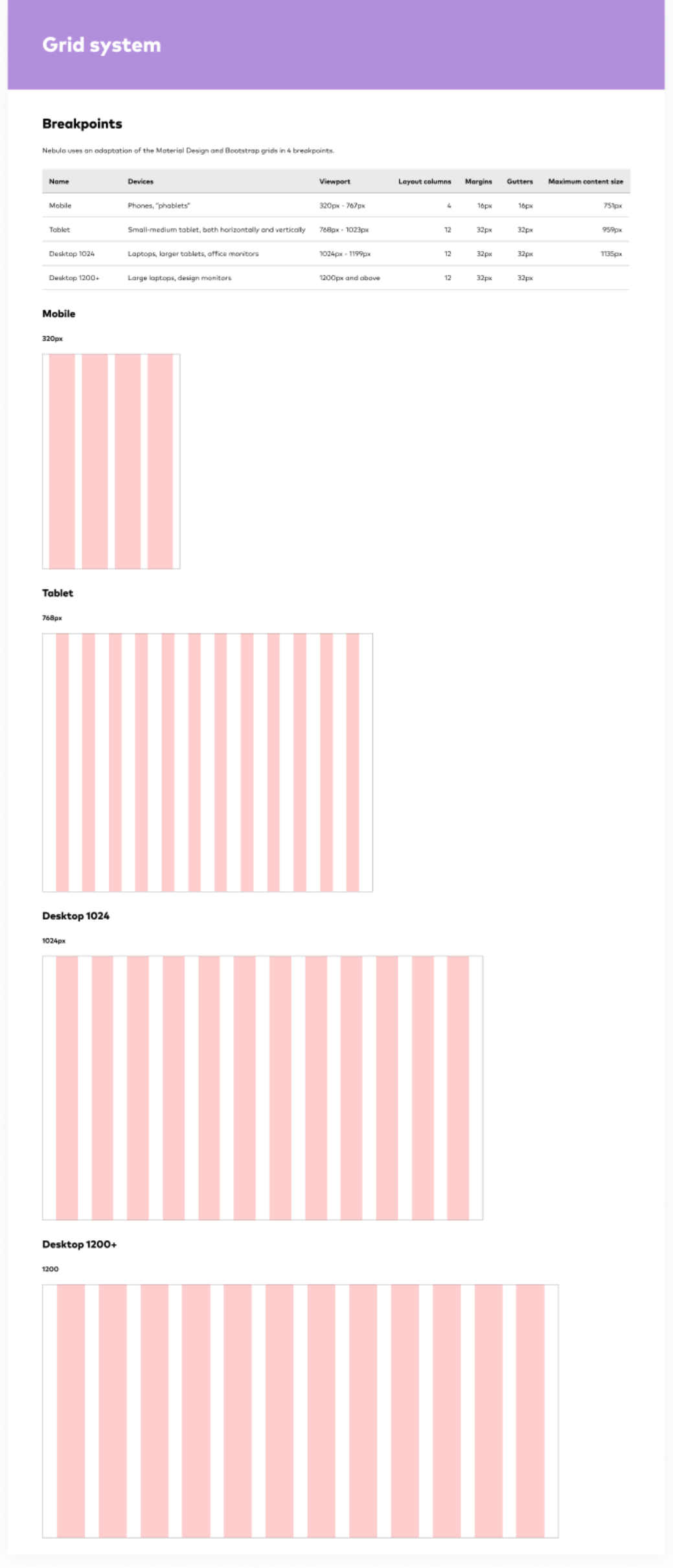
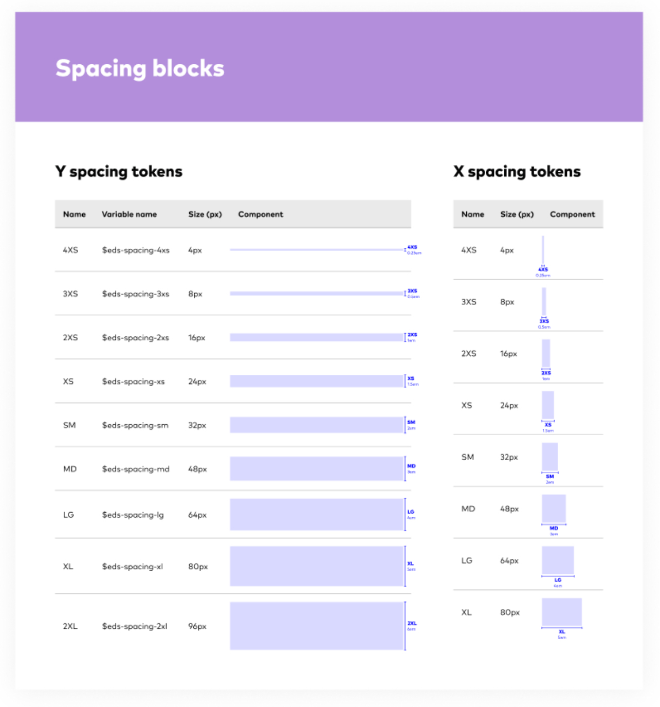
You don't start building a house without it's foundation so the same thing applies to design systems. You just don't use concrete. The foundation of a design system is your spacing and grid system. We use grids to organize and position content in a visually pleasing heirachical structure to support readibility and scalability.
I feel like spacing and grids are some of the most overlooked elements when it comes to visual design but they can make a huge difference in the look and feel of a design. For this project I went with an 4pt grid system of the Material design and Bootstrap grids in 4 breakpoints that consists of a 12 column grid.
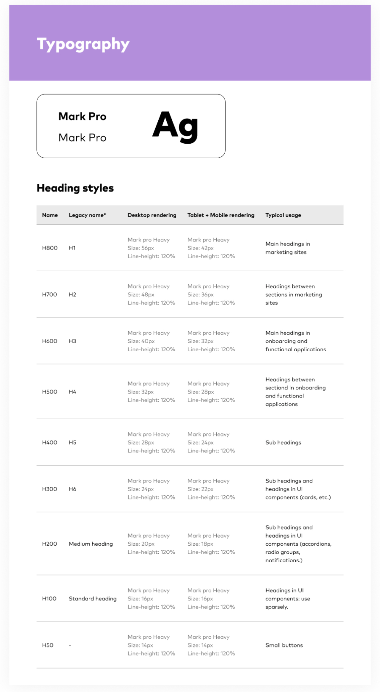
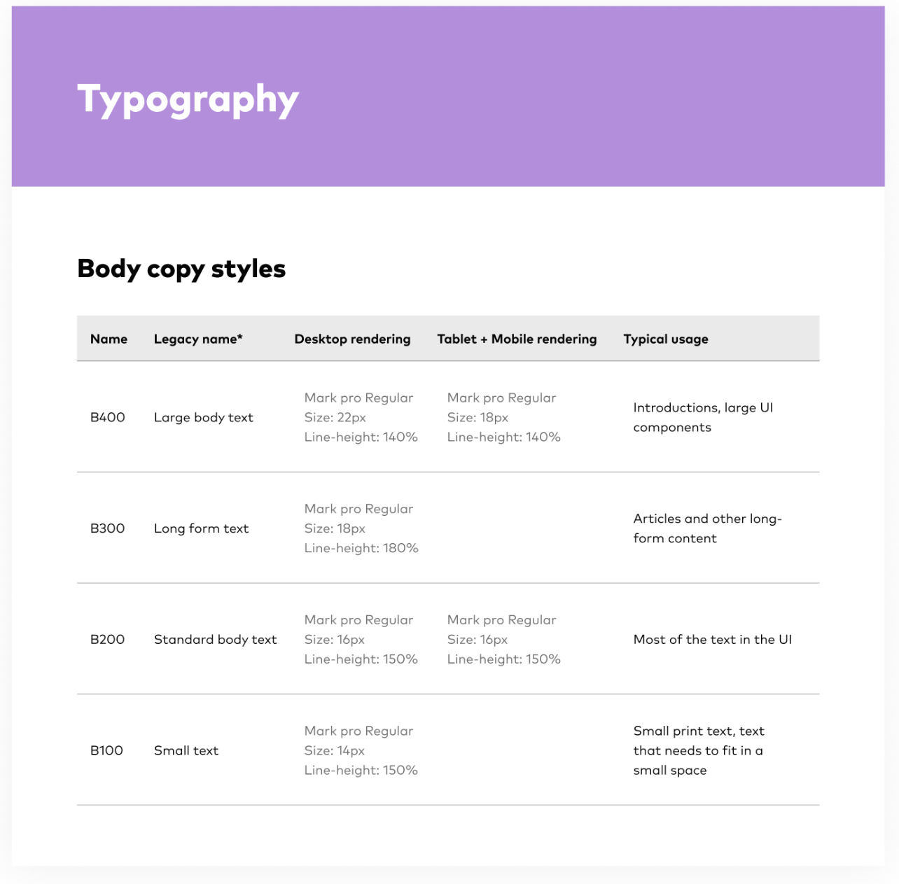
I used the global fonts of Vanguard to make sure the fonts go with branding guidlines of marketing which are Mark Pro. The Nebula Typogrpahy system is responsive, with some equivalent hierarchical elements dispalying in larger font sizes in the Desktop breakpoints and smaller font sizes in Mobile and Tablet breakpoints. We have 8 heading styles and 4 body copy styles.
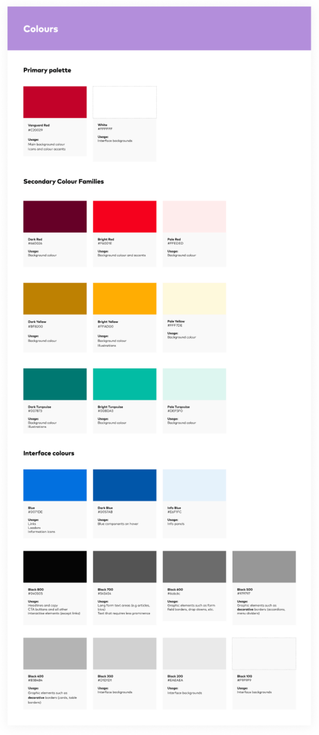
Although I value an aesthetically pleasing use of color, I place a higher value on clear communication. Color supports the purpose of the content, communicating things like hierarchy of information, interactive states, and the difference between distinct elements.
Vanguard is a red brand at core and we balance that red with generous amounts of white and a vibrant secondary palette. Vanguard's primary colour red sits at the center of the Nebula design sytem.
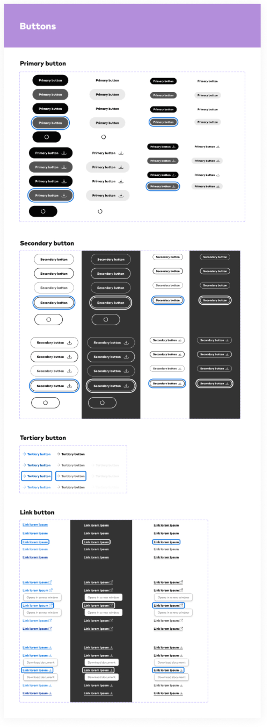
We all know what buttons are, but what many non designers fail to realize is that a single button will have several different states. The most common being active, hover, focus, and disabled. You will also occasionally see a loading state. I decided to use all five of those states in Vanguard along with 4 different button types. Those types are Primary, Secondary, Tertiary, and Link styling. Each of which has an icon version associated with it.
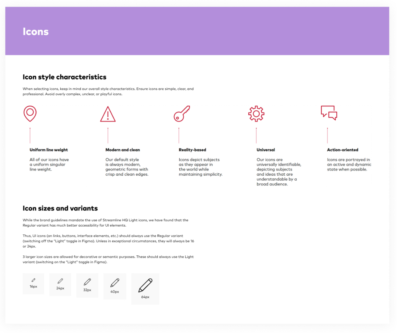
In the Nebula design system we use Streamline icons (a third party plugin) because it's simple, informative, and complements the overall visual language of the design system. I focused on simplicity to help users understand the concept the icon represents and recognize icons on smaller screens. I defined 5 different sizes of icons depending on the content of the page.
Documentation
Results
As the design team grows bigger, I hope to collect feedback
from a designer’s perspective on how the system has improved their workflow and onboarding.
And on the flip side, I’d love to collect feedback on how the design system can be improved
to better serve the purpose of the design team (i.e. what’s the best way to document components
and display guides and instructions).
As the design system gets implemented, I look forward to seeing if it continues to
keep the design consistent. I would love to implement a survey on how the team interacts the
design system on a day to day, and how that has increased their work speed and productivity (or not).