Case study ยท The O2

Food and drink at your seat, not a queue during the interval.

The O2 app already helped visitors navigate the venue. This project added a new food-and-drink ordering journey, so an audience member could order from their seat without losing the break between acts.

Role  Product DesignerScope  New mobile ordering featureTeam  Design Manager, BA, PM and EngineeringTools  Figma
The problem

The interval is short. A queue makes it shorter.

At a large entertainment venue, ordering food or a drink traditionally means leaving your seat, finding a concession and hoping to return before the next act begins. The client wanted that transaction to happen in the existing app instead.

  • Visitors need to know where an order will be delivered
  • Multiple food and drink vendors need to be discoverable
  • Payment must feel quick and familiar on a phone
The design question

How might we turn a venue seat into a confident delivery destination?

The experience had to make the operational detail feel effortless: choose a block and seat first, then browse the right vendors, build a basket and check out with confidence.

How we approached it

Design the customer journey around what the venue needs to fulfil.

01

Map the service

We worked with the client to understand their food and drink vendors, the details each vendor needed to receive, and how orders would be handled on the ground.

02

Make location first

Block and seat selection come before browsing. It establishes the delivery context upfront, rather than asking for it as a surprise at checkout.

03

Test the flow in wireframes

We iterated on the core flow with the team and client before applying visual design, so the operational journey was agreed before visual polish began.

04

Bring it into the app

The final flow used The O2's established visual language, so ordering felt like a natural part of the app rather than a separate service.
The core journey

One clear path: where you are, what you want, and how to pay.

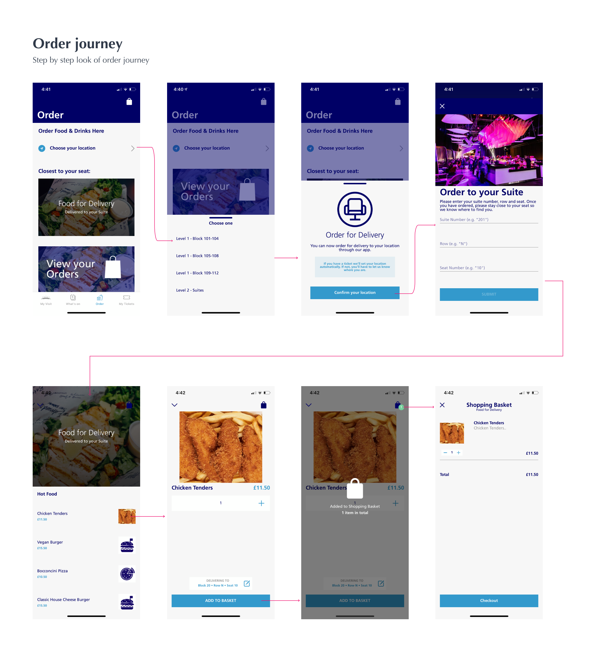
The flow starts with a visitor's location. From there, the app can surface the available food and drink options, let the visitor build their basket, and take them through payment without losing the context of their order.

01

Choose your seat

Block and seat details give the order a real-world destination and prevent a fulfilment problem later.

02

Browse & build a basket

Visitors choose from the venue's food and drink vendors, add items and see their order build in one place.

03

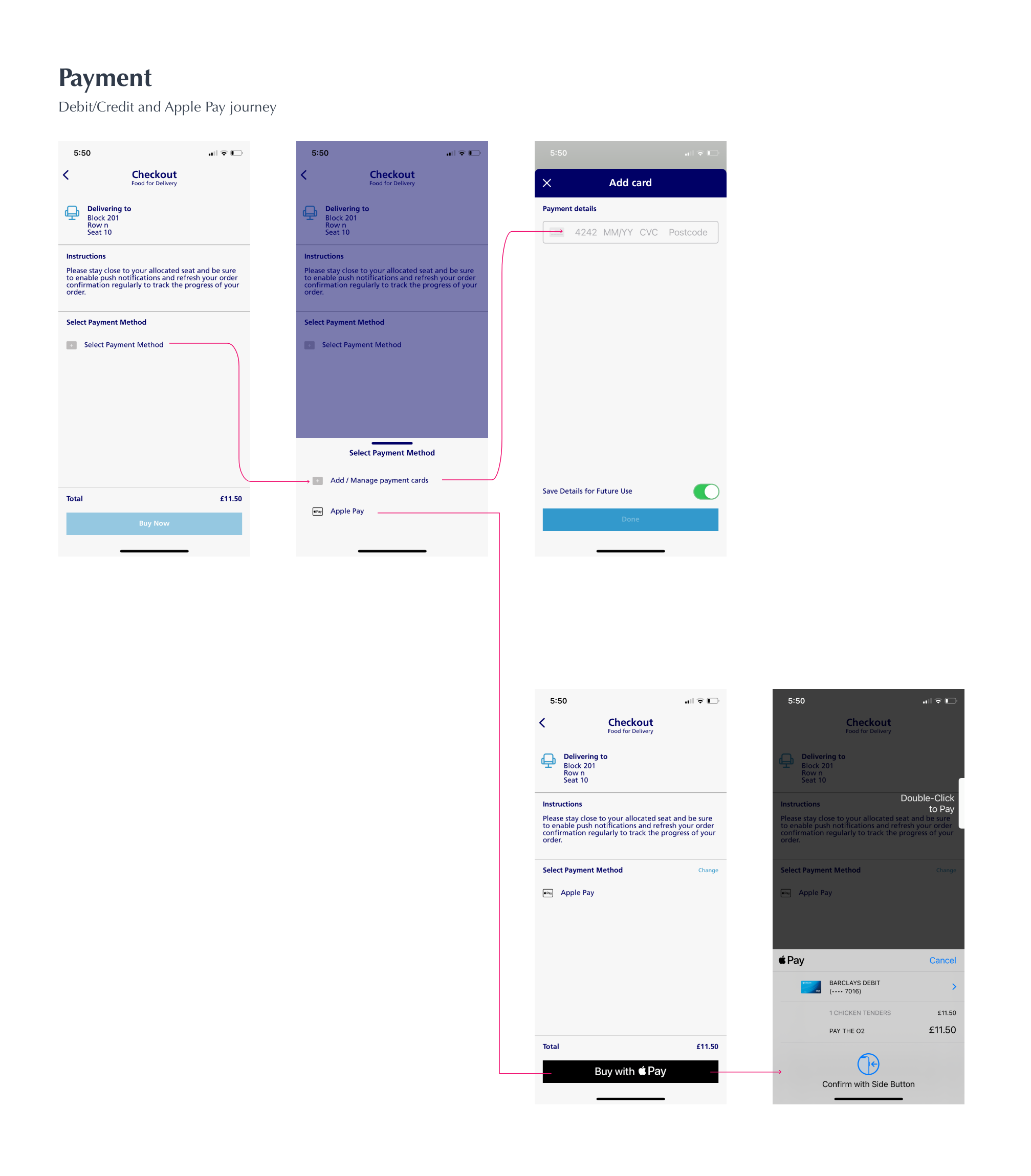
Pay & confirm

A familiar mobile checkout makes the last step feel quick, with payment routes that work for the customer's device.

Ordering

Make the next step obvious at every point.

The ordering tab gives the journey a dedicated home in the app. Location selection happens first; restaurant choice, item selection and basket review follow in a sequence that reflects how an order is actually fulfilled.

The O2 food and drink ordering journey
A service design detail

Seat details are not a formality. They are the handoff.

The most important information in the flow is not the food choice; it is the location that turns a digital basket into an order the venue can actually deliver. Placing it first creates a clear contract for both the visitor and the operator.

The O2 mobile payment flow
Payment

Keep checkout familiar when time matters.

Once a visitor is happy with their basket, checkout offers the relevant payment options for their device. The goal was not novelty: it was a simple, recognisable route to completing an order.

The final experience

A new ordering capability that belongs in the wider O2 app.

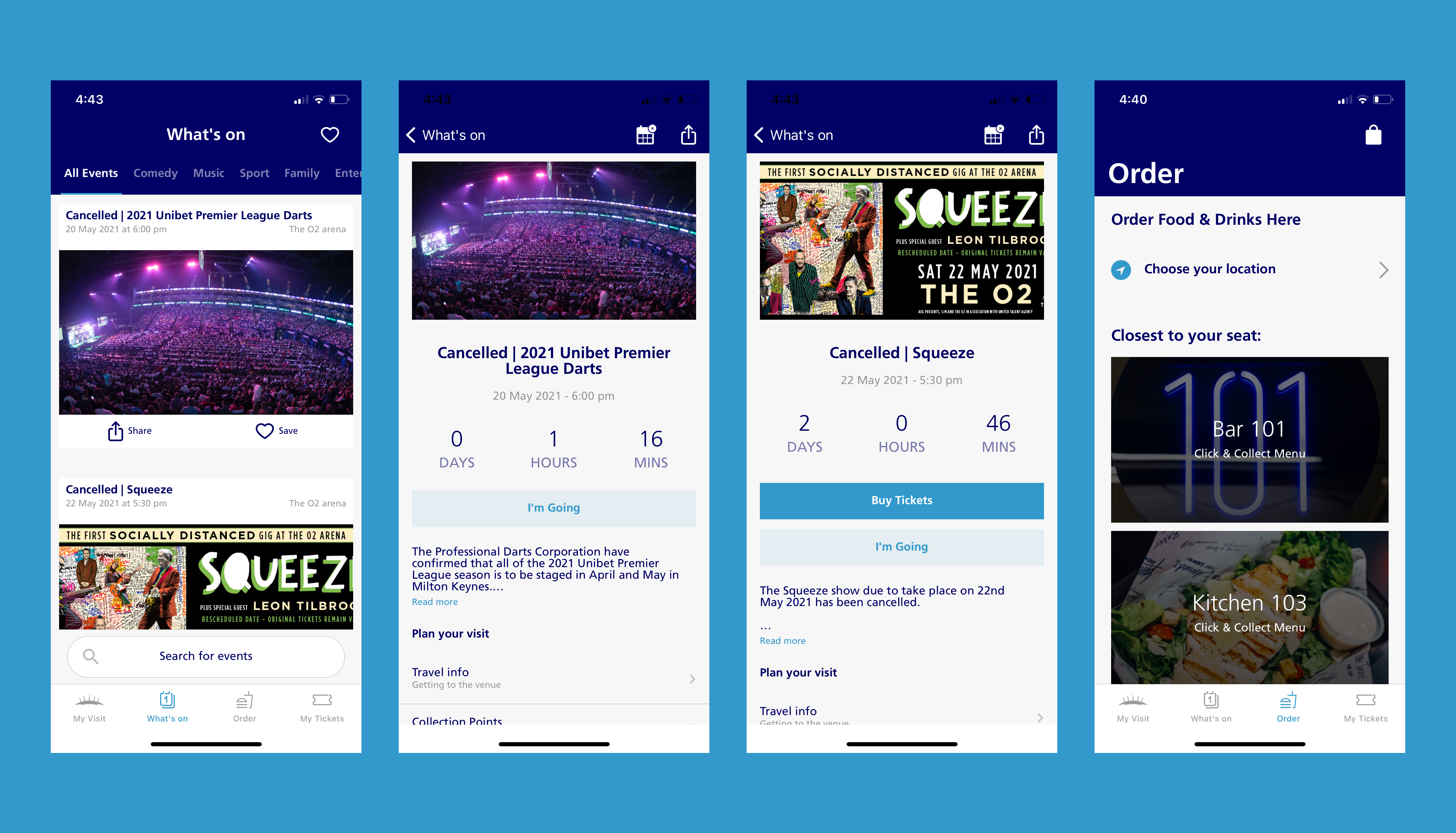
The completed feature sits alongside the app's existing content and navigation, giving visitors a practical way to plan the interval around the show rather than the queue.

The O2 app with the final food and drink ordering flow
The food and drink journey in the context of the wider O2 app.
What I took from it

The best app features are often operational systems in disguise. Here, the user experience depended on making the venue's fulfilment constraints understandable without exposing the complexity behind them. Getting the location right at the start made the rest of the journey simpler for everyone.